

How Flipmind looks and sounds.
Logos, colours, type and tone — plus ready-to-post banners and templates for LinkedIn, Facebook, Instagram, X and YouTube. For our team, partners, press and anyone writing about us.
Flipmind
One word, capital F, lower-case m. Never FlipMind, Flip Mind or FLIPMIND in text. Our legal name is Flipmind Limited.
We do Internet Magic.
Our signature. Its partner, “More human, less machine.”, explains how we do it.
An Auckland and Sydney software company building custom platforms, AI systems and cloud infrastructure for NZ and AU businesses.
Use this when someone needs a short description of us.
The wordmark
Our logo is a custom wordmark: flip in grey, mind in blue. Always use the supplied files — never retype it in a font or rebuild it. Use SVG wherever you can; PNG where SVG isn’t accepted.




The fm icon
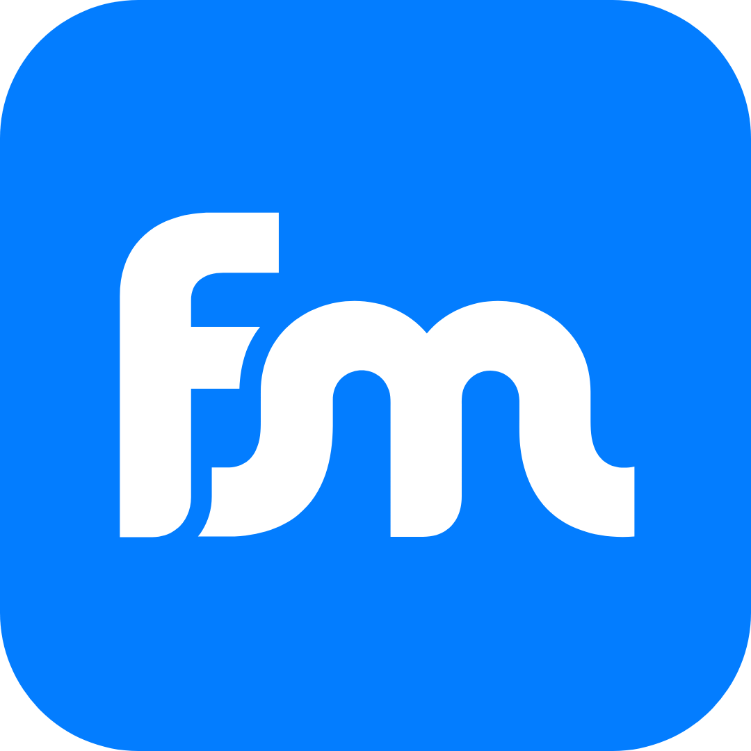
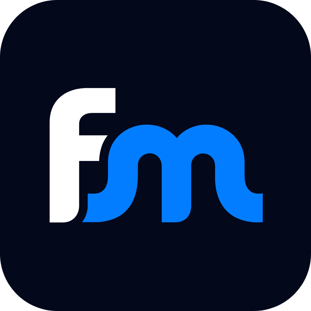
A compact mark for small or square spaces. It never replaces the wordmark where the wordmark fits. Social avatars use the blue tile: it reads at 32 pixels and survives a circular crop.

Clear space
Keep a margin around the logo at least the size of the dot on the i. Nothing — text, edges, other logos — goes inside it.

Minimum size
Smaller than this and the letterforms start to blur. Switch to the icon instead.
Wordmark
100 px wide on screen
30 mm in print

Icon
24 px wide on screen
8 mm in print
Please don’t
Don’t stretch or squash it
Don’t rotate or tilt it
Don’t recolour it
Don’t add shadows, glows or outlines
Don’t put the primary logo on dark backgrounds
Don’t place it over busy images
Blue, grey and a lot of space
The two logo colours are the brand. The digital palette extends them for screens: dark Ink and Navy backgrounds, with blue doing the talking. Click any swatch to copy its hex code.
Digital palette
Balance
Roughly how a typical layout divides up. Blue is the accent, not the wallpaper.
Accessible pairings
- Action Blue on whiteText and buttons ✓
- Sky on InkLinks on dark ✓
- White on Flipmind BlueLarge text and buttons ✓
- Flipmind Blue on whiteHeadlines only, not small text
CMYK values are straight conversions — ask your printer to match the HEX. Older material used #008BE0 and #4C4B4E. Use the values above for anything new.
Two typefaces, used with confidence
Futura PT gives us geometric character for headlines; Proxima Nova keeps everything else easy to read. Both are on Adobe Fonts.
Aa Magic.
Bold italic for statement headlines.
Bold for section titles and buttons.
Uppercase tracked for labels
Headlines in sentence case. Keep them short; highlight one phrase in blue.
Aa 123
Regular for paragraphs, 16–18px on screen with generous line height. Semibold for emphasis — never all caps for whole sentences.
Grey or Slate for supporting text and captions.
Left-aligned. Centre only short headings and single lines.
No Adobe Fonts?
Use these stand-ins in tools that don’t have our fonts.
Word, PowerPoint, Outlook
Century Gothic (headlines) · Arial (body)
Google Docs, Canva
Jost (headlines) · Montserrat (body)
More human, less machine.
We’re engineers who answer our own phones. Everything we write should sound like it — on the website, in proposals, in a LinkedIn comment.
Human first
Write like a senior engineer talking to a smart friend. “We” and “you”, short sentences, no corporate fog.
Honest and specific
Real numbers, real timelines, real trade-offs. If there’s a catch, say it first.
Confident, not loud
Show the work — client names, outcomes, our own products. Let the proof do the shouting.
A little magic
A touch of wit is welcome. “Internet Magic” is ours — use it lightly, once per piece, never in a headline and the CTA.
Posts that look like us
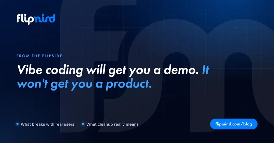
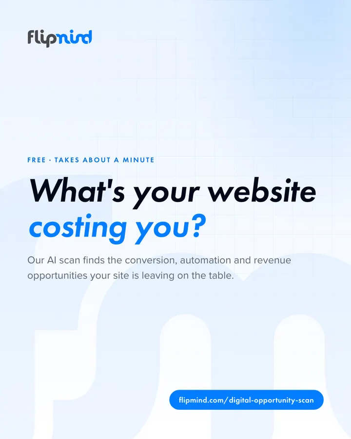
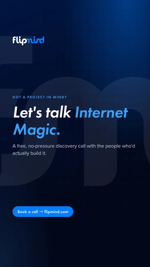
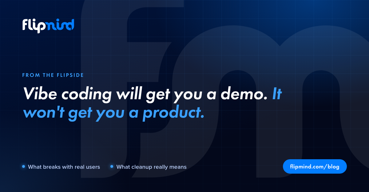
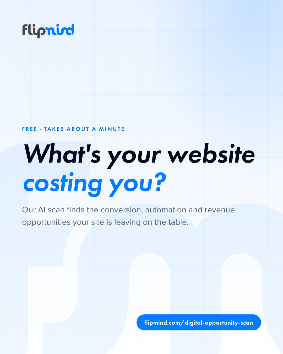
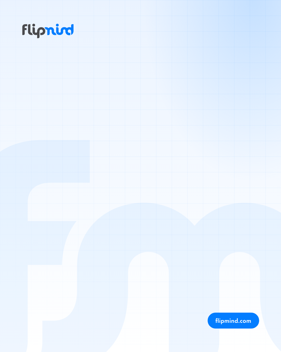
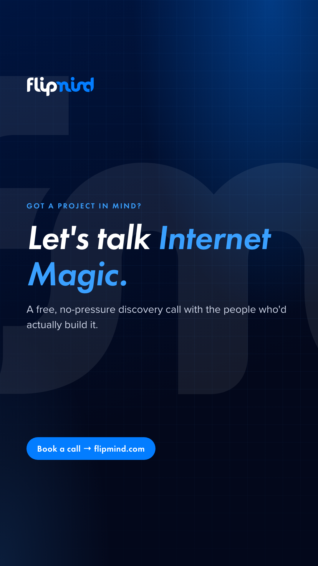
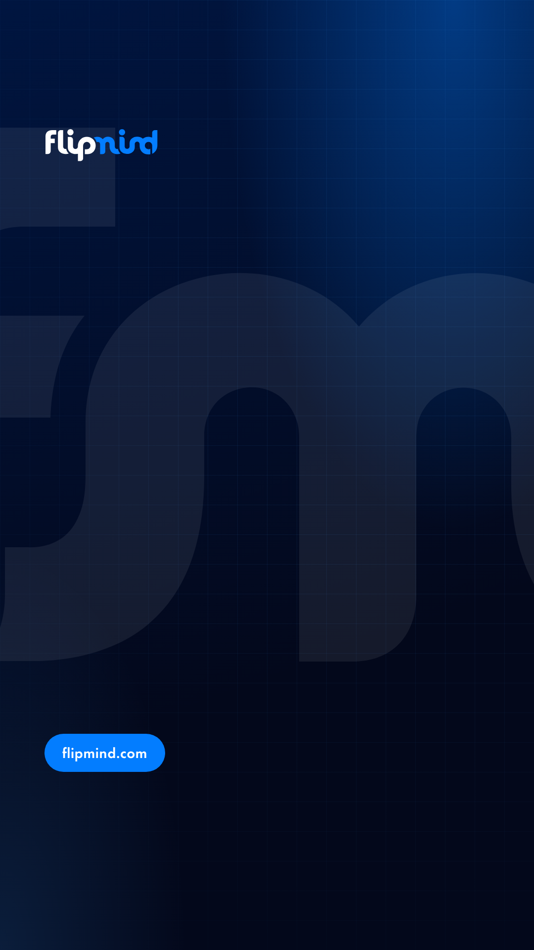
An example of each format, plus a blank with just the background, logo and URL — drop it into Canva, Figma or PowerPoint and add your headline in Futura PT bold italic (or Jost).









Rules of thumb
One message per image
A headline of 4–10 words. If it needs a paragraph, it belongs in the caption or a blog post.
Logo top-left, URL bottom-right
Every template follows this. Never put the logo in the middle or make it the hero.
Headline in Futura PT bold italic
Highlight the payoff in Sky (#3AA0FF) on dark or Flipmind Blue on light — one highlight per headline.
Dark by default, light for contrast
Ink/Navy backgrounds are our signature. Use the light version to break up a run of posts.
Real work beats stock
Screenshots of what we built, team photos and client logos (with permission) over stock imagery. No AI-generated people.
Caption: hook, value, link
Lead with the insight, not “We’re excited to announce”. Tag clients and partners. 1–3 relevant hashtags, at the end.
Email signature and video calls
Fill in your details, copy the signature, and paste it into Outlook or Gmail’s signature settings.
Video call background — dark
1920 × 1080 for Teams, Zoom and Google Meet. Turn off “mirror my video” so the logo reads correctly to you.

Video call background — light
1920 × 1080 for Teams, Zoom and Google Meet. Turn off “mirror my video” so the logo reads correctly to you.
Slides and documents
Reversed logo on Ink for title slides, primary logo on white for content. One idea per slide; the logo goes on the cover and closing slide, not on every page.
Partners and press
Use the primary logo on light pages and the reversed or all-white logo on dark ones. Please link it to flipmind.com and don’t combine it into a lock-up with your own.
Something not covered?
Need another format or approval for a co-branded piece? Email sales@flipmind.com and we’ll sort it.
Profiles and banners
Every Flipmind profile uses the blue fm avatar and the matching banner below. Sizes are what each platform recommends today; the files are exported at those sizes (LinkedIn at 2× for sharp retina display).
LinkedIn — company page ↗
LinkedIn — your personal profile
Facebook
flipmind.com
Instagram
X (Twitter) ↗
YouTube